
Control multi-flavour snack artwork with a complete SKU identity record, not colour alone. Product name, approved copy, images, quantity, coding and file revision must all belong to the same variant. A front that looks correct can still be paired with another flavour's back panel or an obsolete product description.
Give each variant a fingerprint
Create an internal SKU reference and identify flavour, product form, size and language version. Link the reference to the current product specification and approved copy. If the recipe or product description is still changing, keep artwork release pending for the affected content rather than approving a convenient provisional version.
Keep product imagery accurate to the intended pack. Do not let a shared library image imply components absent from a particular variant. The responsible product and content owners should approve the representation. The converter needs a clear file set, not responsibility for guessing which flavour description is current.
Build identity from controlled product information
Begin each file with a product identity reference rather than a design colour. The same flavour name can exist at several declared quantities or language versions, while a similar-looking front may conceal a different ingredient statement. Give the artwork team a controlled source for every field that can change.
Ask the responsible content owner to identify the source document and its revision. A designer's previous file is a useful starting asset but should not become the authority for current product copy. If an item is pending, record that status in the internal index and keep the affected production release open.
GS1's GTIN Management Standard provides rules for assessing changes to trade-item identification. The responsible brand owner should review the applicable rule when a product or declared quantity changes. A packaging colour change alone should not be used as the buyer's method for assigning or confirming identity.
Keep barcode identity, artwork version and commercial SKU connected but distinguish their purposes. An internal stock reference helps ordering, a trade-item identifier supports the relevant supply-chain identity, and a file revision identifies the design being approved. One field cannot safely stand in for all three.
Separate common design rules from variant content
Shared elements may include logo position, brand typography and a range hierarchy. Variant elements may include product name, ingredient-related copy, visual cues and quantity. Have the content owner identify the actual variable fields. A flavour change can affect more than the front colour.
Review range recognition with packs shown together. Review copy accuracy one SKU at a time against the approved source. These are different tasks. A contact sheet of colourful fronts is useful for recognition but cannot demonstrate that every back panel is correct.
Review the range horizontally and vertically
Use two review passes. In the horizontal pass, compare the same field across all variants: names, quantities, imagery, codes and language. This makes an accidental repeated element easier to notice. In the vertical pass, check one complete SKU against its approved source from front through every back and side region.
An illustrative six-SKU range could contain three flavours in two sizes. Create six complete identity records even if the range uses one design system. The smaller size may have a different panel arrangement and code region, so approval of its larger counterpart does not close every review task.
Record the sequence of review deliberately. A colour contact sheet answers whether variants are distinguishable as a group. A full-resolution proof answers whether the actual copy and symbols are correct. A dimensioned construction proof answers whether those elements sit in the intended pack regions.
Avoid treating reviewer familiarity as evidence. A person who recognises the brand may overlook a duplicated back panel. Give reviewers the controlled source and a clearly defined comparison task. Procurement can coordinate sign-off without substituting its own judgement for the accountable content and technical owners.

Use a SKU fingerprint card
| Field | Release check |
|---|---|
| SKU and size | Matches order and product specification |
| Front identity | Product and variant are correct and distinguishable |
| Product copy | Matches the approved content source |
| Imagery and cues | Appropriate to this variant |
| Code region | Agreed location and variable-data task |
| File identity | Complete artwork and drawing revisions linked |
This original card travels with the proof review. Add a reviewer and decision for each field. A blank approval cell means the task remains open; it should not silently inherit approval from another flavour.
Review the filled graphic shape
Use the actual construction drawing and a representative filled mock-up. Check whether variant cues remain visible around folds, curvature and the intended display arrangement. Ishida's snack resource treats presentation as distinct from weight and damage. Artwork approval should likewise remain a defined task rather than a general product approval.
If side or gusset panels carry content, review them explicitly. A revised front file may leave an old side-panel story in place. Record the complete proof identity and compare it with the fingerprint card before release.
Trace a shared correction into every complete file
When a common item changes, make an affected-file list before editing. Identify each flavour, size, language and construction that uses it. The list becomes the closure record, showing the revised complete-file identity and renewed approval for every affected item.
For an illustrative correction, a common address line changes in six complete artworks. Five corrected proofs are approved and one still contains the earlier line. The range is not fully corrected simply because the shared master asset was updated. The sixth complete output needs its own confirmation.
Distinguish intentional variation from accidental inconsistency. A common typography rule may allow a longer product name to use a defined arrangement, while regulated or product-specific content can legitimately vary. Review against the approved rule and source rather than demanding visual sameness where the products differ.
Keep superseded files clearly identified in the controlled workflow. A repeat order should point to the released complete file, not an email attachment chosen by recency. If a supplier receives conflicting references, resolve the index before production release. Asking them to infer the intended flavour from a thumbnail transfers a preventable identity risk into the order.
Control shared corrections and repeat orders
When a common element changes, identify every affected SKU. Record which complete files received the correction and which need renewed approval. Preserve a release index so a repeat order can refer to exact approved artwork rather than “the latest design.”
Esko's packaging content-management page describes controlled reuse of text, claims, symbols and barcodes and identifying artworks affected by a content change. Apply the same discipline in the SKU fingerprint record: name the shared correction, list every affected complete file and record each renewed approval. Buying that software is not a prerequisite for maintaining the original worksheet.
Check the printed pack as a member of the range
After content review, examine the representative filled geometry. Place the relevant variants in their intended display arrangement and observe whether the distinguishing cues remain visible. Keep this assessment separate from content accuracy because both must be satisfied for a useful release.
Review the regions affected by seams, folds and filled curvature. If the small-size pouch hides a secondary cue, record the actual location and viewing condition. The action may be to revise that file's panel arrangement rather than changing the entire range colour system.
Build the order schedule directly from the release index. For each line include the commercial SKU, declared quantity, approved drawing, complete artwork revision and ordered quantity. A purchasing schedule that uses only short flavour names can lose the size or language distinction established during design review.
At the handover meeting, close mismatches between the order schedule and approved index before asking for production release. Retain a representative approved output for each SKU. This gives receiving and repeat-order teams a traceable reference and helps distinguish a production discrepancy from an intentional artwork revision introduced after the previous order.
Snack artwork: a practical specification example
A snack brand is comparing an upright pouch with a flexible pack supplied from rollstock. Use the actual snack, since bulky pieces can settle or break differently from a powder or grain. Record the filled volume, the amount of clear closing space and the retail presentation. A resealable format also needs to be checked after part of the product has been consumed.
For this decision, start with the visible panel and proposed window. The useful output is full-size artwork reviewed at the intended filled height. Put that output beside the relevant quotation, drawing or sample rather than leaving it in a separate email. This is an illustrative decision exercise, not a report of a completed customer trial.
Product references to make the discussion concrete
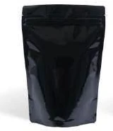
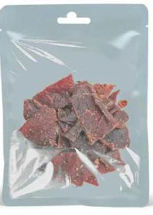
The catalogue includes window pouches and transparent stand-up pouches. These examples show different physical constructions; they are not interchangeable specifications. A window reveals part of the product while retaining an opaque area for artwork. Define its shape and location on the dieline, then check it at the intended fill level. An empty mockup can make a window appear better positioned than it is after the product settles.
| Format reference | Material or construction to clarify | Details to include in the brief |
|---|---|---|
| Window pouches | A transparent window combined with paper-look or opaque flexible panels; confirm the full structure and product requirements. | Window width, height and location; product visibility at full and low fill. |
| Transparent stand-up pouches | Transparent flexible film or laminate; optical clarity does not identify its barrier properties or complete composition. | Required clear viewing area; print coverage and opaque backing needs. |
Use the reference pictures to identify the base, side panels, window or opening that you mean. A picture cannot supply the missing dimensions or material layers. If a photograph shows a finish or closure you do not want, state that difference explicitly; otherwise a visual reference can introduce an unintended requirement.
Complete the record before requesting the next sample
- Attach full-size artwork reviewed at the intended filled height. Identify the product or SKU and the date of the observation.
- Record the visible panel and proposed window. Keep confirmed information separate from proposed values and questions for the supplier.
- Add the actual fill weight or volume, the dimension convention, material proposal and intended closure. Include the number of designs and quantity per design when requesting a quotation.
- State which question the next drawing, sample or quotation must resolve. A change of size, closure or material should remain visible alongside the earlier reference.
This record makes the next conversation specific. It lets the design, purchasing and packing teams work from the same proposed item and shows which decision still needs evidence. Review the related product pages for format details, or prepare a custom packaging brief with the unresolved requirements.

Send one organised range package
An illustrative release error is a correctly coloured makhana front paired with another seasoning's back copy. The fingerprint card catches the mismatch because the product-copy field has its own source and approval. Front appearance alone cannot close that field.
Send Navkar Poly Print the SKU fingerprint cards, complete artwork index, approved drawings and quantity by variant. Identify pending content clearly before requesting production release. That gives the supplier an orderable range whose files can be checked against the same product identities used by purchasing and packing.
Sources and scope.
These references support the technical discussion. Product photographs illustrate formats; the material, dimensions and suitability of the proposed pack are confirmed for each project.
- Ishida snack food packaging applications
Equipment manufacturer treats pack weight, damage and pack presentation as separate snack-line concerns.
- Esko: WebCenter content management for packaging and labels
Primary packaging-software page directly describes reusable content and artwork impact analysis; the article offers its own independent SKU worksheet, with no required software purchase or compliance guarantee.
- GS1 GTIN Management Standard
Trade-item identification changes should be assessed against applicable GS1 rules by the responsible brand owner; does not assign specific GTINs.
Let’s discuss your product.
Share your contents, dimensions, filling method, quantity and delivery destination. We’ll work through the proposed packaging specification with you.
Create a packaging brief