Choose matte or gloss snack packaging by the product promise, print quality, retail lighting and measured customer response. Matte can communicate differently from gloss, but neither finish automatically looks more premium or sells more. Compare matched filled samples and test the specific design hypothesis before extending it across the range.
Define the design problem first
Is the existing pack hard to read under store lights, inconsistent with the brand, easily marked during handling or weak in a mobile thumbnail? Each problem suggests a different test. A finish change should answer one of these questions rather than simply follow a fashionable description.
Record the snack, intended positioning, price and buying occasion. An indulgent fried snack, a lightly seasoned makhana product and a gift assortment can communicate different promises. Avoid copying a finish from an unrelated category without asking whether its visual cues support your actual product.
Keep the technical structure in the brief. The visual finish and the barrier construction are different decisions. A matte-looking surface does not establish a particular oxygen barrier, while a glossy surface does not imply greater protection or a longer expiry period.
What the original research measured
The 2020 paper Fats are Glossy but Does Glossiness Imply Fatness? used an online survey and a quasi-experiment to study food perceptions. Glossy packaging signalled greater perceived fatness within the research, affecting other evaluations. It did not establish a sales uplift for every matte snack pack.
The 2021 review On the Questionable Appeal of Glossy/Shiny Food Packaging discusses how context and associations complicate a universal preference claim. Use the research to form a local design hypothesis, not a rule that one surface always wins.
Build matched print samples
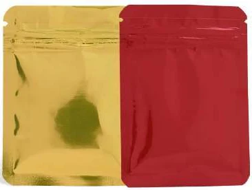
Use the same artwork, dimensions, fill quantity and intended structure where practical. Specify the actual finish construction with the converter, because two samples labelled matte can differ in visual and handling characteristics. Record the material and print references used.
Keep colour and image differences visible. Changing the finish can alter the appearance of the same artwork, while changing the artwork at the same time creates another variable. If both need revision, run a staged review so the team can understand which change solves the problem.
Evaluate production-representative samples rather than only digital renders. A screen cannot reproduce every reflection, tactile impression or surface interaction. Use the render to organise the concept, then confirm the decision with the actual proposed printed and filled pack.
Test the buying view
Place the candidates at the intended viewing distance and orientation. Use representative store lighting and record the conditions. Check brand recognition, flavour identification, quantity readability and whether reflections obscure information at ordinary angles.
Then review matched product photographs at mobile thumbnail size. Keep camera, background, scale and lighting comparable. A gloss sample photographed with strong reflections and a matte sample photographed carefully would create an unfair online comparison.
Ask viewers what they believe the product is and what qualities they expect before explaining the finish. Words such as premium, natural or healthy can steer responses. Capture their unaided interpretation and the design element that led to it.
Separate five useful outcomes
| Outcome | What to observe |
|---|---|
| Recognition | Can users identify brand, snack and flavour quickly? |
| Readability | Does information remain legible under relevant lighting and handling? |
| Product expectation | What taste, texture, quality or price cues do users infer? |
| Surface appearance | How does the actual pack look after agreed handling and distribution? |
| Commercial response | Do conversion and contribution improve under a defined channel test? |
These outcomes can disagree. A finish may attract attention but make text harder to read. A premium perception may not support the required price. Keeping separate records helps the designer choose a targeted improvement instead of declaring an overall winner too early.
Review handling and distribution appearance
Inspect filled samples before and after the agreed handling evaluation. Record marks, abrasion, creasing, print appearance and any other agreed cosmetic criteria. The converter and technical team should select appropriate evaluation methods for the proposed structure and route.
Check how the pack behaves in the actual outer carton and retail arrangement. Contact with adjacent packs or fixtures may matter more than a brief hand inspection. Preserve a reference sample and photographs with conditions so later complaints can be compared meaningfully.
Do not assume that a finish's appearance after handling proves seal integrity or food protection. Those remain separate technical requirements. A pack can look attractive while failing another acceptance criterion, or show cosmetic marks while its contents remain technically acceptable.
Obtain a comparable finish quotation
Ask whether the finish changes material, printing, conversion, setup, inspection or minimum commercial quantity. Record the actual construction and quote date. A generic percentage premium from another supplier or country is not a reliable budget for the proposed job.
Compare the same artwork count and accepted quantity. Separate launch setup from recurring cost, and include any effect on filling or delivered carton economics when supported. A finish that requires a much larger order can create stock exposure even when its unit premium is small.
For a multi-flavour range, calculate the cost by design and total programme. A premium applied to ten slow-moving variants can create a different commitment from the same premium on one stable product. Procurement needs both the unit calculation and the cash exposure.
Calculate the commercial hurdle
Assume an invented finish change adds ₹0.40 per accepted pack plus ₹4,000 of setup. At 25,000 packs, the first-batch addition is ₹10,000 + ₹4,000 = ₹14,000. If an additional sale contributes ₹20 before this incremental expense, recovering ₹14,000 requires 700 additional sales in a simplified model.
These figures are invented and are not a prediction that the finish will create 700 sales. The model excludes price changes, cannibalisation, returns and other costs. Add those effects when known and use the actual contribution boundary agreed by the business.
If the finish solves a required readability or handling problem, a sales-uplift target may be the wrong justification. The benefit could be meeting a clear acceptance criterion. State that purpose directly instead of inventing a revenue story for every design improvement.
Run a pilot that can answer the sales question
Define one primary hypothesis and one primary commercial outcome before launch. Keep product, quantity, price, promotion and availability comparable where practical. Record buying exposures and completed purchases rather than only likes, attention or image clicks.
Monitor contribution, returns, complaints and repeat purchase alongside conversion. A design that attracts more first purchases but creates misleading product expectations can perform poorly later. The packaging promise should match the actual snack experience.
Use a suitable test duration and analysis plan chosen for the available traffic or store activity. There is no universal small sample that proves a stable uplift. An inconclusive pilot can still reveal readability or production problems without supporting a broad claim.
Keep range rollout controlled
If a candidate performs well, confirm that its print and handling behaviour transfers to the other designs before ordering the entire range. Different colour coverage and imagery can change the visual result. Preserve approved references so repeat orders can be assessed consistently.
Separate existing stock run-down from the new-design launch. Mixing old and new packs without a plan can confuse the commercial test and create unnecessary inventory. Procurement should see the transition quantity, approval status and circumstances that require renewed review.
Control the approved finish reference
Keep an approved physical reference for the chosen finish and its artwork version. Agree how repeat samples will be viewed and which differences require review. A label such as soft matte or high gloss is not a complete reproducible specification.
If colour coverage, imagery or material changes, assess the new sample rather than assuming the previous visual response transfers unchanged. The reference should support a practical supplier discussion, not create an unexplained subjective rejection.
Record who owns appearance approval and who owns technical acceptance. That distinction helps procurement resolve a mismatch quickly while preserving the product and commercial requirements tested in the pilot.
Matte versus gloss snack pouch: a practical specification example
A format comparison is useful when it answers the actual buying question. Define the customer action and the filled product before deciding that one appearance is better. A valve, window, zipper or matte surface changes a different part of the specification. Some features can coexist, so compare their purposes and constraints rather than forcing every decision into an either-or choice.
For this decision, start with the actual artwork and surface preference. The useful output is full-size printed references compared under the same light. Put that output beside the relevant quotation, drawing or sample rather than leaving it in a separate email. This is an illustrative decision exercise, not a report of a completed customer trial.
Product references to make the discussion concrete
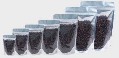
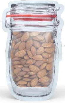
The catalogue includes coffee pouches with valve and jar-shaped zipper pouches. These examples show different physical constructions; they are not interchangeable specifications. A degassing valve and a reclosable zipper serve different purposes. Choose the pouch geometry first, then specify the valve position, zipper and final top seal as separate features. Stand-up, side-gusset and flat-bottom examples help compare panel area and shelf footprint.
| Format reference | Material or construction to clarify | Details to include in the brief |
|---|---|---|
| Coffee pouches with valve | Paper-look or opaque flexible laminate with an optional degassing valve; the complete barrier structure is specified for the coffee and storage brief. | Coffee form and intended fill; packing interval after roasting. |
| Jar-shaped zipper pouches | Clear or frosted flexible pouch construction with a zipper; the jar shape is a profile, not a rigid container. | Usable cavity and narrowest opening; die-cut outline and corner radii. |
Use the reference pictures to identify the base, side panels, window or opening that you mean. A picture cannot supply the missing dimensions or material layers. If a photograph shows a finish or closure you do not want, state that difference explicitly; otherwise a visual reference can introduce an unintended requirement.
Complete the record before requesting the next sample
- Attach full-size printed references compared under the same light. Identify the product or SKU and the date of the observation.
- Record the actual artwork and surface preference. Keep confirmed information separate from proposed values and questions for the supplier.
- Add the actual fill weight or volume, the dimension convention, material proposal and intended closure. Include the number of designs and quantity per design when requesting a quotation.
- State which question the next drawing, sample or quotation must resolve. A change of size, closure or material should remain visible alongside the earlier reference.
This record makes the next conversation specific. It lets the design, purchasing and packing teams work from the same proposed item and shows which decision still needs evidence. Review the related product pages for format details, or prepare a custom packaging brief with the unresolved requirements.
Choose the finish for a documented reason
Choose matte or gloss when the matched samples support the intended product perception, remain readable and meet the agreed handling criteria. Use commercial pilot evidence for any sales conclusion. Avoid presenting either surface as a universal route to premium pricing or longer freshness.
Send Navkar Poly Print the snack brief, artwork, intended finish references, retail conditions and quantity by design. Request comparable production-representative samples and quotations. Give procurement and B2B heads separate findings for appearance, technical acceptance and the commercial hurdle.
Sources and scope.
These references support the technical discussion. Product photographs illustrate formats; the material, dimensions and suitability of the proposed pack are confirmed for each project.
- Fats are Glossy but Does Glossiness Imply Fatness?
Context-specific food-perception hypothesis. No universal matte sales uplift or technical pack result.
- On the Questionable Appeal of Glossy/Shiny Food Packaging
Avoid universal finish preference claims. No project sales prediction.
Let’s discuss your product.
Share your contents, dimensions, filling method, quantity and delivery destination. We’ll work through the proposed packaging specification with you.
Create a packaging brief