A clear window can help shoppers inspect nuts, but an opaque or food-image design may communicate the offer just as effectively. Choose the visual treatment after checking product appearance, light exposure, complete material performance and customer understanding. Visibility is a design tool, not proof of longer freshness or increased sales.
Define what the window should accomplish
State the problem before drawing the window. It might be showing nut size, reassuring buyers about the assortment or making the product more recognisable. A window designed without a clear purpose can consume useful panel space without improving the buying decision.
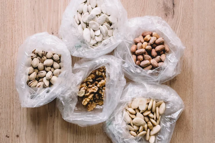
Record the exact nuts, processing, mix and expected appearance variation. Whole almonds, broken cashews and mixed dry fruit present different visual information. Use representative production samples rather than selecting unusually attractive pieces for the prototype.
Choose the channel too. In a physical shop, a customer can move the pack and inspect it. In an ecommerce thumbnail, the photographed window becomes a fixed image. These experiences may require different visual emphasis and should be tested separately.
What the eye-tracking study found
The 2020 experiment Transparent Windows on Food Packaging Do Not Always Capture Attention and Increase Purchase Intention analysed 45 young participants after exclusions. It compared transparent windows, food graphics and non-food graphics on screen across selected foods, including nuts.
Transparent and food-graphic versions attracted more viewing time than the baseline, without a significant difference between those two approaches. The study measured attention and stated responses, not observed retail sales. Its young Chinese sample and screen-based designs limit transfer to Indian retail buyers and actual filled packs.
The useful decision is to test a matched food image alongside a window rather than assuming transparency must win. A clear image can sometimes communicate the same product information while leaving a different material and panel design available for technical review.
Separate visual transparency from protective performance
Specify the window's dimensions, position and construction in the proposed material system. A clear area may be part of the same film or involve another design arrangement. The technical reviewer needs the actual specification rather than the phrase transparent pouch.
Assess light exposure, relevant barrier properties, seals, closure and the product's storage requirements together. An opaque appearance does not automatically establish high oxygen or moisture protection. A transparent appearance does not, by itself, quantify the finished pack's shelf life.
The 2018 raw almond storage study demonstrates that storage environment and packaging affect acceptance in a defined experiment. It does not rank window designs. Use product-specific completed-pack evidence before claiming that the proposed visual treatment keeps nuts fresh longer.
Compare three matched prototypes
Build a window version, a food-image version and an appropriate baseline with the same brand, quantity and core information. Keep colour hierarchy and product positioning as comparable as practical. Otherwise the test may measure a different headline or layout instead of visibility.
Use actual filled prototypes for the window review. Product settling can move nuts away from the intended viewing area or expose ordinary variation. A digital mockup with perfectly arranged contents can create a misleading impression of how the pack will look in trade.
Photograph each candidate under the same conditions for online comparison. Match scale, background, angle and lighting. If the window version receives brighter lighting and the opaque pack uses a dull image, any preference result becomes difficult to interpret.
Ask questions that diagnose understanding
| Question | What the answer helps reveal |
|---|---|
| What product is this? | Basic recognition and whether the image or window creates confusion |
| What do you expect inside? | Perceived mix, nut form and quantity expectations |
| What information helped you decide? | The role of visibility compared with brand, price or wording |
| What makes you hesitate? | Appearance variation, unclear contents or missing information |
| Which would you buy at this price? | A stated choice under a defined price condition, requiring commercial validation |
Collect unaided responses before explaining the design. Ask why people chose an alternative and record disagreements. A small test is useful for identifying problems, but its percentage preference should not be presented as a reliable market-share forecast.
Inspect the pack beyond the first viewing
Review the filled pack after ordinary settling and the agreed handling evaluation. Check whether abrasion, creasing or contact with product affects the window or graphic. A design that looks excellent immediately after filling may communicate differently after distribution.
For a family pack, inspect the partly emptied state. A window may expose a reduced fill level, while a food image stays visually constant. Neither observation automatically makes one preferable, but it can influence the brand's intended use experience and should be considered honestly.
Keep product acceptance and cosmetic acceptance separate. A scuffed window may reduce presentation value without proving a food-quality problem. A clear, attractive window can also coexist with an unresolved protective requirement. Recording the distinction leads to a more precise corrective action.
Calculate the real design cost
Ask whether the proposed window changes structure, printing coverage, material sourcing, conversion or inspection. Obtain an equivalent quote for the opaque or food-image alternative at the same quantity and design count. Do not assume a window is free because it uses less ink in one area.
Here is an invented financial example. A design change adds ₹0.35 per accepted pack and ₹5,000 initial artwork or setup expense. At 20,000 packs, the first-batch addition is ₹7,000 + ₹5,000 = ₹12,000, or ₹0.60 per pack. These values explain allocation and are not current market rates.
Add any genuine change in filling, rejects, outer packing or delivered cost. If there is no meaningful cost difference in the actual quotations, choose based on the qualified protection and customer evidence. A design decision does not need an invented saving to be commercially useful.
Design a suitable storage comparison
Keep product batch, fill quantity, process, closure and intended storage conditions controlled as far as practical. Record exactly what changed between prototypes, including material layers or window area. The technical owner should define relevant product-quality and safety measures.
Include the light conditions that matter to the intended display and distribution where the study design calls for them. Avoid using a dark cupboard result to support a bright retail exposure claim without appropriate evidence. Similarly, a material datasheet alone is not a completed filled-pack trial.
If one candidate performs better, report the tested system and conditions. Do not generalise the result to every nut, every window size or every supplier's film. Preserve the evidence so later artwork or material changes can be reviewed against the same decision boundary.
Measure the commercial result at the right level
After technical acceptance and design comprehension, run a defined channel pilot if the business question is sales. Track buying exposures, conversion, contribution, returns and repeat purchase. Keep price, promotional support and availability visible because they can drive differences that resemble a design effect.
For online sales, distinguish image click-through from completed purchase. A transparent-looking image might attract curiosity without improving checkout conversion or margin. For retail, distinguish shopper attention from actual purchase and from repeat satisfaction with the product.
Use representative appearance variation
Show normal variation in product size, colour and settling during the design review. A window that works only when unusually large nuts are arranged carefully may create a different impression in ordinary production. The presentation should remain honest across the accepted product range.
Ask the quality and brand teams to agree what appearance is acceptable inside the viewing area. This is distinct from the product's technical release criteria. A nut can be acceptable to eat while its placement creates an unintended visual message in the chosen window.
Review how the window is photographed for ecommerce. If the image shows a more generous-looking arrangement than customers normally receive, the design may attract a first purchase while creating disappointment later. Track related complaints and repeat purchase in the pilot rather than judging the concept from attention alone.
These observations can lead to a different window size, position or food-image treatment. They provide a concrete next design action without requiring an unsupported claim that all transparent packs are better or worse.
Clear versus opaque nut pouch: a practical specification example
A format comparison is useful when it answers the actual buying question. Define the customer action and the filled product before deciding that one appearance is better. A valve, window, zipper or matte surface changes a different part of the specification. Some features can coexist, so compare their purposes and constraints rather than forcing every decision into an either-or choice.
For this decision, start with the product visibility and storage brief. The useful output is the viewing area separated from material-performance requirements. Put that output beside the relevant quotation, drawing or sample rather than leaving it in a separate email. This is an illustrative decision exercise, not a report of a completed customer trial.
Product references to make the discussion concrete
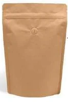
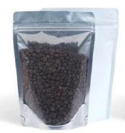
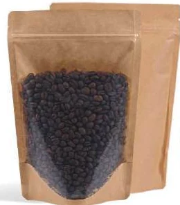
The catalogue includes window pouches and jar-shaped zipper pouches. These examples show different physical constructions; they are not interchangeable specifications. A window reveals part of the product while retaining an opaque area for artwork. Define its shape and location on the dieline, then check it at the intended fill level. An empty mockup can make a window appear better positioned than it is after the product settles.
| Format reference | Material or construction to clarify | Details to include in the brief |
|---|---|---|
| Window pouches | A transparent window combined with paper-look or opaque flexible panels; confirm the full structure and product requirements. | Window width, height and location; product visibility at full and low fill. |
| Jar-shaped zipper pouches | Clear or frosted flexible pouch construction with a zipper; the jar shape is a profile, not a rigid container. | Usable cavity and narrowest opening; die-cut outline and corner radii. |
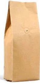
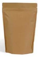
Use the reference pictures to identify the base, side panels, window or opening that you mean. A picture cannot supply the missing dimensions or material layers. If a photograph shows a finish or closure you do not want, state that difference explicitly; otherwise a visual reference can introduce an unintended requirement.
Complete the record before requesting the next sample
- Attach the viewing area separated from material-performance requirements. Identify the product or SKU and the date of the observation.
- Record the product visibility and storage brief. Keep confirmed information separate from proposed values and questions for the supplier.
- Add the actual fill weight or volume, the dimension convention, material proposal and intended closure. Include the number of designs and quantity per design when requesting a quotation.
- State which question the next drawing, sample or quotation must resolve. A change of size, closure or material should remain visible alongside the earlier reference.
This record makes the next conversation specific. It lets the design, purchasing and packing teams work from the same proposed item and shows which decision still needs evidence. Review the related product pages for format details, or prepare a custom packaging brief with the unresolved requirements.
Make a conditional visual choice
Choose a window when representative product visibility helps the buyer and the complete protective system passes the required review. Choose an opaque or food-image approach when it communicates more clearly or better supports the qualified construction and brand brief.
Send Navkar Poly Print the nut product, window purpose, target area, fill quantity, proposed display conditions and quantity by design. Request matched candidate structures and filled samples. Give procurement and B2B heads separate evidence for protection, appearance, cost and observed buying behaviour.
Sources and scope.
These references support the technical discussion. Product photographs illustrate formats; the material, dimensions and suitability of the proposed pack are confirmed for each project.
- Transparent Windows on Food Packaging Do Not Always Capture Attention and Increase Purchase Intention
Test a matched food graphic alongside a window. Attention and stated responses are not retail sales or material protection evidence.
- raw almond storage study
Separate protection and environment from geometry. No flat-bottom-versus-stand-up or window-design ranking; no Navkar expiry.
Let’s discuss your product.
Share your contents, dimensions, filling method, quantity and delivery destination. We’ll work through the proposed packaging specification with you.
Create a packaging brief